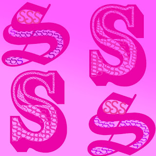
1. I think that the strongest area of my work was using symmetry, because the picture was almost entirely made up of the 4 capital s's so if they weren't symmetrical, it wouldn't look as appealing as it currently does.
2. I think that I can definitely improve on playing with text more, because each of the letters look almost the same. The only difference is the size and font.
3. I think that it was east to maintain a stick to one color and just use different shades, because there are so many colors that you could use, but I didn't want my project to have so many different text colors, because an easy way to get a pop of color is by using a rainbow gradient.
4. It was difficult for me to determine what I wanted to with my letter, because the only thing that I could think of was using small s's to fill in big ones.
5.I the only tool I used was the gradient tool which is pretty self-explanatory. It made the background have a gradient from hot pink to baby pink.
6.The objective of this activity by using a letter to create an image that used different elements of composition. I achieved this by using symmetry and repetition.
7.If I did this activity again I would want to choose another letter and play around more with textures and text tools.
Effort: 4
ReplyDeleteComposition: 2
Originality: 2
Elements/Principals: 4
Reflection: 3
15=B-
You used more than one tool. You used the move tool, gradient, and text tool.