Saturday, December 10, 2016
Personality Self-Portrait Albium Cover
1.) I think that the strongest are of my work was using the magic wand tool and the quick selection tool to remove the blank space from the background of almost all of the images I chose
2.) I think that I need to work on using filters more, because this was the first project I've used filters on and on some of the pictures it looks almost exactly the same as it did before I used a filter.
3.) In this project, it was easy for me to find different blend modes to change the appearance of some images.
4.) It was difficult for me to remove the blank space from the butterfly and the supernatural logo, because I didn't want to accidently delete some of the butterfly wings and I couldn't use the magic wand tool without it getting rid of more than I wanted it to on the supernatural logo, because the picture had somewhat of a gradient.
5.) I used the move tool to move the images into their own layers. I used the magic wand tool and the quick selection tool to get rid of the blank space in most of the images. I used the blend mode overlay to change the color of the background photo I used, pin light to make the images of people look a little more transparent without lowering the opacity and hard mix to change the color of the crown. I used the lasso tool to remove the blank space on the supernatural logo. I used the cross hatch filter on Dodie, the grain filter on Dan and Phil, the sprayed strokes filter on the youtube logo and the ink outlines filter on the picture of Marina and the colorful rose.
6.) I demonstrated the objective in this activity by choosing at least 13 images, putting them into layer masks and changing the blend modes and filters of the images to make them look like one cohesive image.
7.) If I did this project again I would choose different pictures from the start, because I made this project longer than it needed to be, because I wasted time editing pictures that I ended up deleting.
Wednesday, November 2, 2016
Monday, October 31, 2016
Wednesday, October 19, 2016
Clone Wars
 Reflection:
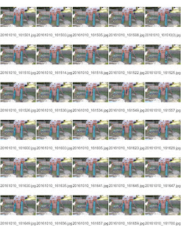
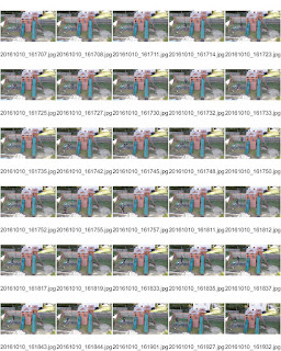
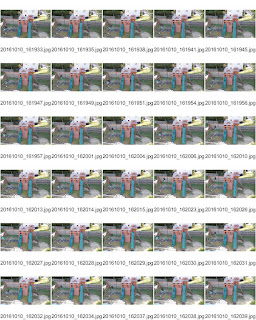
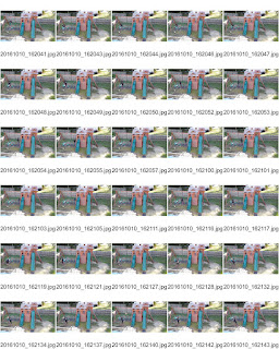
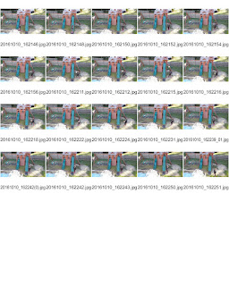
1.) I think that the strongest area of my work was lining up the pictures, because I didn't use a tripod, so the pictures weren't perfectly lined up, but I tried my best.
2.) I think that I could definitely get better at using the paint tool, because for a while I had no idea how to use it with layer masks, but I feel more confident using it now.
3.) It was really easy for me was lining up my pictures the best that I could, considering that they weren't taken with a tripod.
4.) It was difficult, at first, to use the paint tool with layer masks, because I didn't understand it at first, but eventually got the hang of it.
5.) I used the move tool to line up my pictures and I used the brush tool to paint myself into the layering pictures.
6.) I demonstrated the goal of this activity by lining up 5 pictures and merging them into one layer that shows five "clones" of myself.
7.) If I did this project again, I would definitely use a tripod, because it would make everything easier to line up.
Tuesday, October 4, 2016
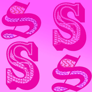
1. I think that the strongest area of my work was using symmetry, because the picture was almost entirely made up of the 4 capital s's so if they weren't symmetrical, it wouldn't look as appealing as it currently does.
2. I think that I can definitely improve on playing with text more, because each of the letters look almost the same. The only difference is the size and font.
3. I think that it was east to maintain a stick to one color and just use different shades, because there are so many colors that you could use, but I didn't want my project to have so many different text colors, because an easy way to get a pop of color is by using a rainbow gradient.
4. It was difficult for me to determine what I wanted to with my letter, because the only thing that I could think of was using small s's to fill in big ones.
5.I the only tool I used was the gradient tool which is pretty self-explanatory. It made the background have a gradient from hot pink to baby pink.
6.The objective of this activity by using a letter to create an image that used different elements of composition. I achieved this by using symmetry and repetition.
7.If I did this activity again I would want to choose another letter and play around more with textures and text tools.
Monday, September 26, 2016
Subscribe to:
Comments (Atom)


