My ideas:
12/18/18:
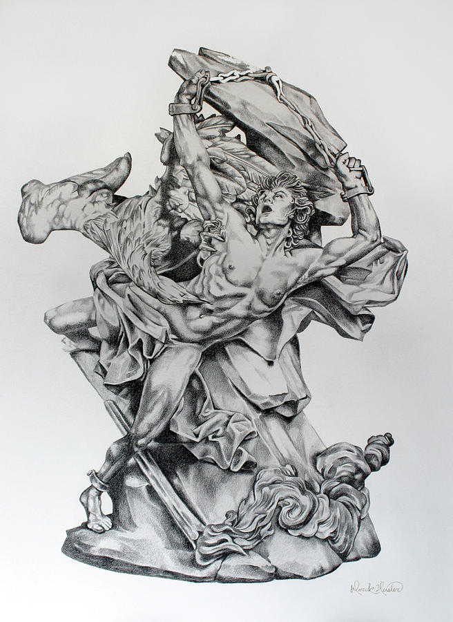
So I was looking for reference images and the first thing I googled was "Prometheus drawing" and I came across this image on fineartamerica.com which was captioned as "Prometheus is a drawing by Mark Heisler which was uploaded on July 10th, 2016."
Link: https://fineartamerica.com/featured/prometheus-mark-heisler.html
Then, I searched for a blissful image to represent Prometheus observing humans: his creations (according to Greek Mythology). I remembered a giant from a book I read as a child and I thought it was written by Shel Silverstein, but I was wrong. After reaching this dead end, I googled "giant character kid book" and stumbled across a screenshot from the film adaptation of The BFG by Roald Dahl:
Source: http://puui.qpic.cn/vcover_hz_pic/0/ln6qczk5gt8by7l1481600044/0
12/20/2018:
Then I tackled the scroll issue. I wanted to tell the story of Prometheus in scroll form with drawings which wouldn't take me as long as my last project, but still carried along the 'knowledge' idea looming throughout my works. My mind quickly went to the storybook in Shrek. On my search for good examples from the book, I found the images below:
1. True Love's Kiss
http://shrek.wikia.com/wiki/File:Storybook.jpeg
https://vignette.wikia.nocookie.net/shrek/images/2/26/Storybook.jpeg/revision/latest/scale-to-width-down/1024?cb=20180420130935
2. Dragon's Keep
http://shrek.wikia.com/wiki/Dragon%27s_Keep
https://i2.wp.com/vignette.wikia.nocookie.net/shrek/images/6/62/Shrek1_page3_woolf.jpg/revision/latest?cb=20100516155521
Sophia Vines
Tuesday, December 18, 2018
Wednesday, December 5, 2018
Wednesday, January 25, 2017
Tuesday, January 24, 2017
Digital Painting
1.) I think that the strongest area of my work was blending the feathers with the mixer brush. I think that the color looked most realistic there.
2.) My work can be improved on by blending the beak and head of the scarlet macaw with the mixer brush. That was the part of the painting that I think would've looked much better if it was done much better.
3.) The easiest part of this project to make the outlines around the color shifts. Though it was very time consuming, it resulted in some great colors and it took the least amount of time even though it took a whole class.
4.) The hardest part of this activity for me was to blend with the mixer brush tool, because I didn't think that I effectively blended dark colors with light colors. When it came to blending, I think that I could've done much better.
5.) In this project I used the paint brush to outline the color shifts and to later on fill in those outlines. The eye dropper was used to select a specific color to fill in the outlines and the mixer brush was used to blend the paint sections.
6.) I demonstrated the objective in this project by using layers to separate the reference photo from the drawing layer and painting layer. I used the paint tool to outline the color shifts and fill in the outlines. I used the eye dropper to select a color to fill in the outlines and I used the mixer brush to blend the colors.
7.) If I did this project again I would want to paint someone, either real or a cartoon instead of a scarlet macaw and I would try harder to use the mixer brush to make the color more even.
Friday, January 6, 2017
Tattoo
1.) I think that the strongest area of my work was drawing the tattoo, because I spent a lot of time putting lots of detail into it.
2.) I think that my work could be improved by making the tattoo seem more realistic by using getting used to using the dodge and burn tools more.
3.) I think that the easiest part of this project was cropping the tattoo, placing it and using the dodge and burn tools.
4.) The hardest part of this project for me was drawing the tattoo solely because it took the longest amount of time and that was the part I put the most effort into.
5.) During this project, I used the move tool to place the tattoo on my arm, I used the quick selection tool to remove the background tool, I used the eraser tool to erase the part of the tattoo that wasn't on my skin. I used the dodge tool to lighten the tattoo where the sun hit my arm and the burn tool to darken the shadow where the shadows were.
6.) I demonstrated the objectives in this activity by choosing a picture that followed the rule of thirds, I used blend modes to blend the tattoo into my skin and I used the dodge and burn tools to make the tattoo look more realistic and I used the blur tool to blend the edges.
7.) If I did this project again I would draw a different tattoo and take a different picture to put the tattoo in an entirely different place and I wouldn't spend so much time trying to remove the white space within the tattoo. Instead of wasting about three classes using the polygon lasso tool, I would just remove the background and put use the blend mode multiply.
Saturday, December 10, 2016
Personality Self-Portrait Albium Cover
1.) I think that the strongest are of my work was using the magic wand tool and the quick selection tool to remove the blank space from the background of almost all of the images I chose
2.) I think that I need to work on using filters more, because this was the first project I've used filters on and on some of the pictures it looks almost exactly the same as it did before I used a filter.
3.) In this project, it was easy for me to find different blend modes to change the appearance of some images.
4.) It was difficult for me to remove the blank space from the butterfly and the supernatural logo, because I didn't want to accidently delete some of the butterfly wings and I couldn't use the magic wand tool without it getting rid of more than I wanted it to on the supernatural logo, because the picture had somewhat of a gradient.
5.) I used the move tool to move the images into their own layers. I used the magic wand tool and the quick selection tool to get rid of the blank space in most of the images. I used the blend mode overlay to change the color of the background photo I used, pin light to make the images of people look a little more transparent without lowering the opacity and hard mix to change the color of the crown. I used the lasso tool to remove the blank space on the supernatural logo. I used the cross hatch filter on Dodie, the grain filter on Dan and Phil, the sprayed strokes filter on the youtube logo and the ink outlines filter on the picture of Marina and the colorful rose.
6.) I demonstrated the objective in this activity by choosing at least 13 images, putting them into layer masks and changing the blend modes and filters of the images to make them look like one cohesive image.
7.) If I did this project again I would choose different pictures from the start, because I made this project longer than it needed to be, because I wasted time editing pictures that I ended up deleting.
Wednesday, November 2, 2016
Subscribe to:
Posts (Atom)